Experience App
Reimagining a mobile ticketing & cmmerce platform
Overview
Acquired by Cox Enterprises in 2014, Experience (ExpApp) is a mobile app platform that offers commerce, ticket sales, and data solutions for over 350 sports teams and entertainment venues. For fans using the platform, it allows them to personalize every live event with exclusive merchandise, VIP experiences and flexible tickets.
TL;DR
As Director of Product Design I lead the end-to-end user experience and design. I worked in partnership with a another UX designer to produce the various artifacts and deliverables seen here.

The challenge
Post-acquisition, Experience was ready to push their platform to the next level. The user experience and overall visual design of the platform had not been updated or changed significantly since the company was founded in 2011. With upwards user growth and an eye towards new partnerships, I was challenged to:
- Improve the overall user experience
- Ensure any new UX solutions will scale
- Update the visual design and brand feel
- Increase user engagement between gamedays. The platform excelled at attracting single game buyers but most of those users would not return until the next gameday
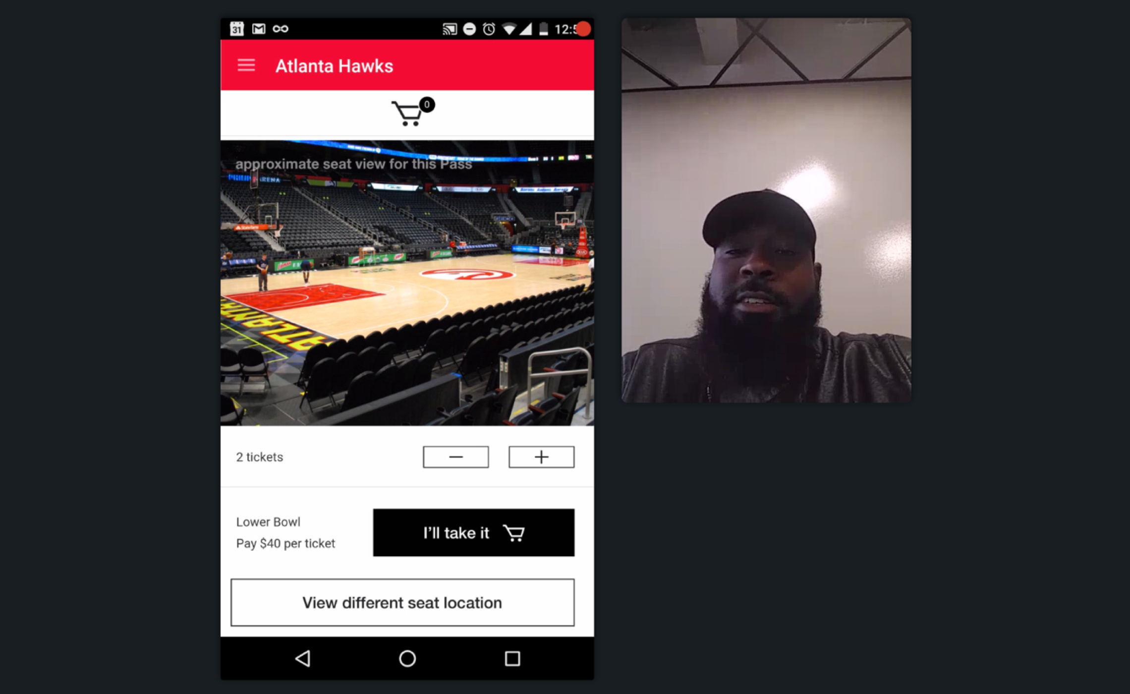
- Showcase VIP experience packages, seat upgrades, & merchandise. A significant percentage of users would only buy event tickets without exploring additional offerings
The approach
To successfully meet the goals of the redesign, we used a hybrid design approach combining elements from IDEO's Human Centered Design and Google Venture's Design Sprint methodologies.
In order to best understand the current state of the product we performed a total UX audit. We first started by understanding our user's main motivations and pain points. We did this by collecting and reviewing user feedback gathered from helpdesk tickets and user surveys.
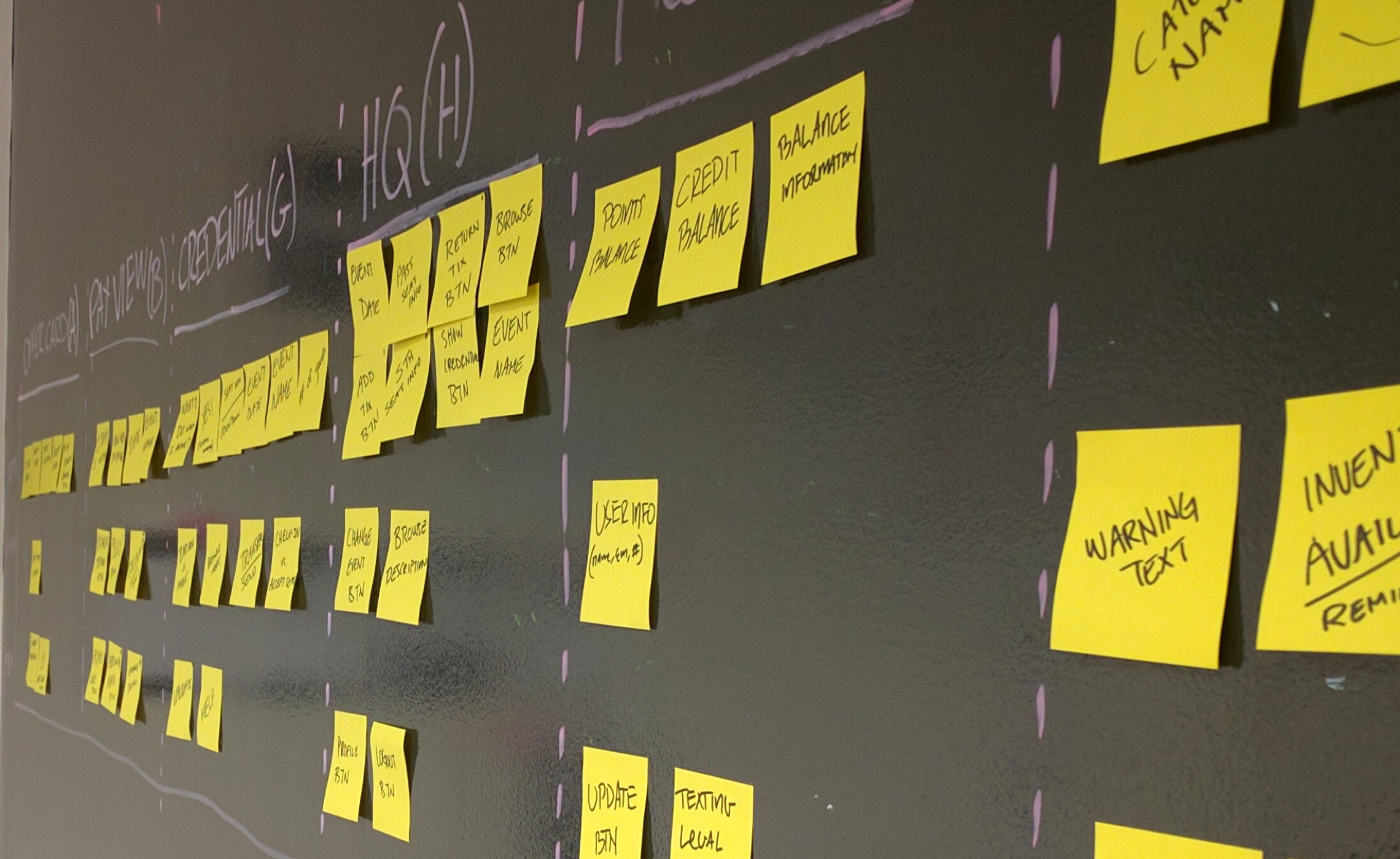
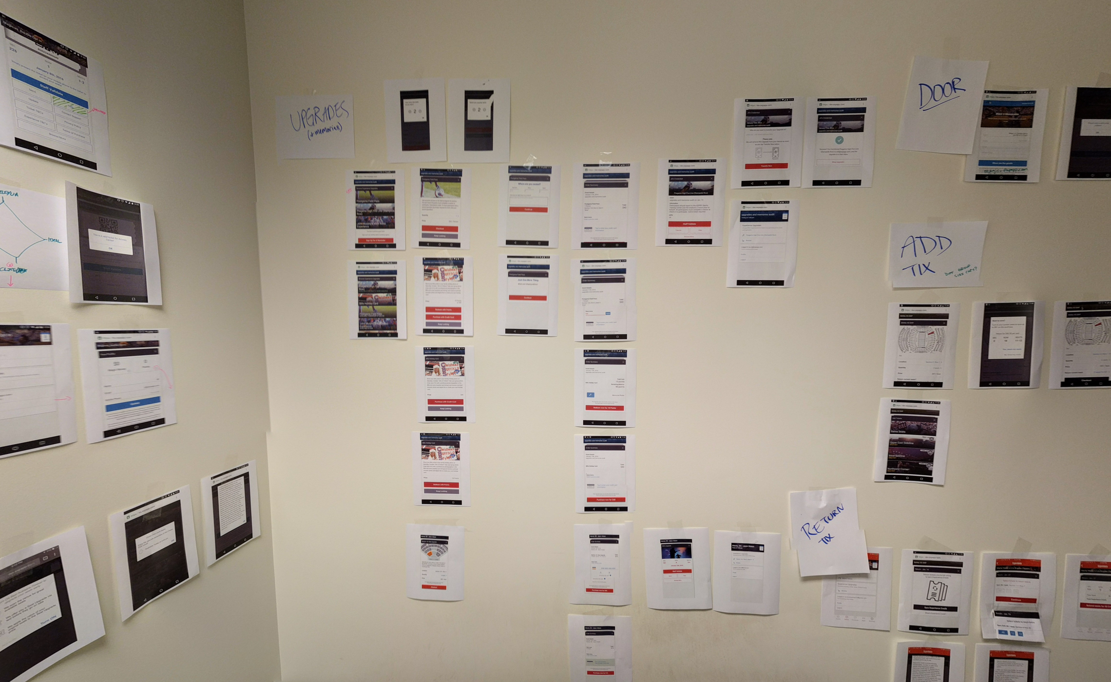
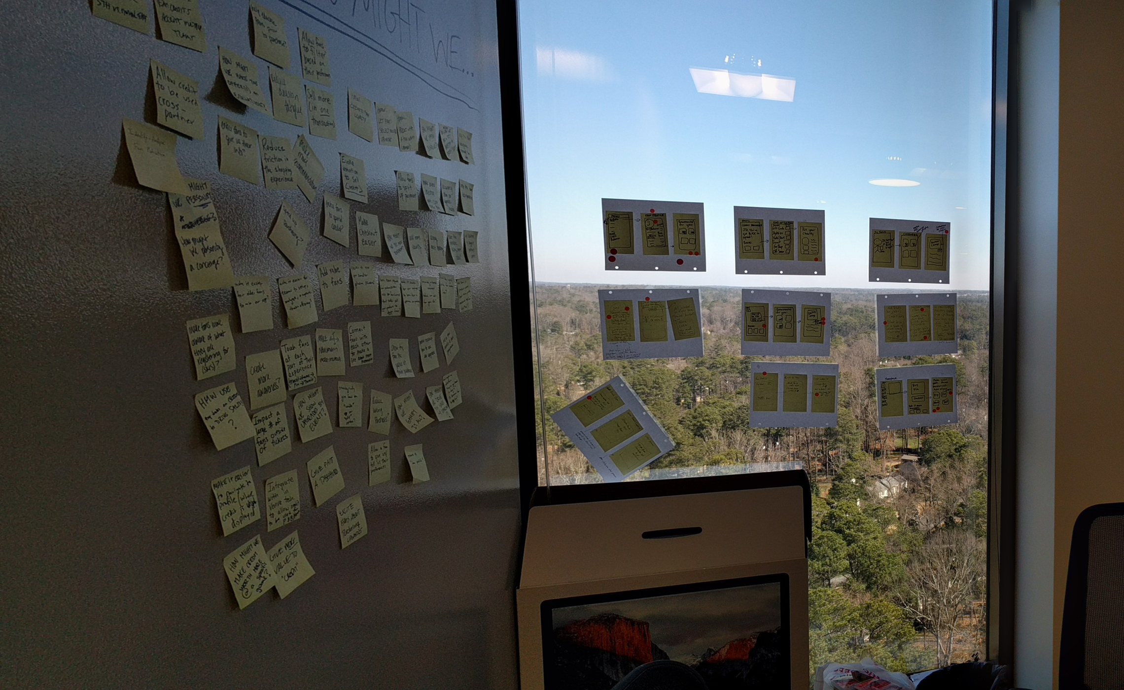
Next, we sought to understand the system and how user flows/screens were connected. We took a tactile approach by physically printing app screens and taping them to the walls. This gave us a physical space to reference when talking about changes to the overall UX or UI. We also did a UI inventory of all common UI components.
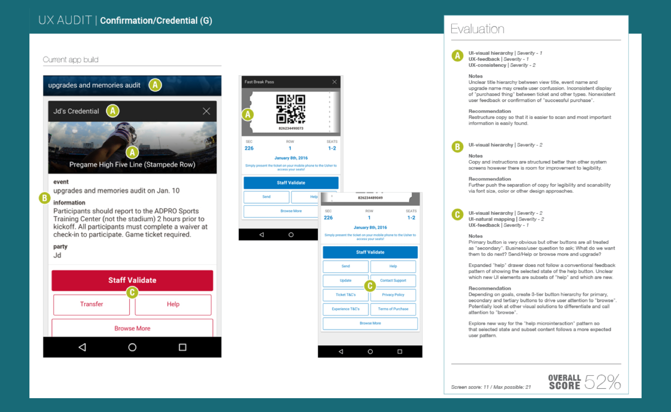
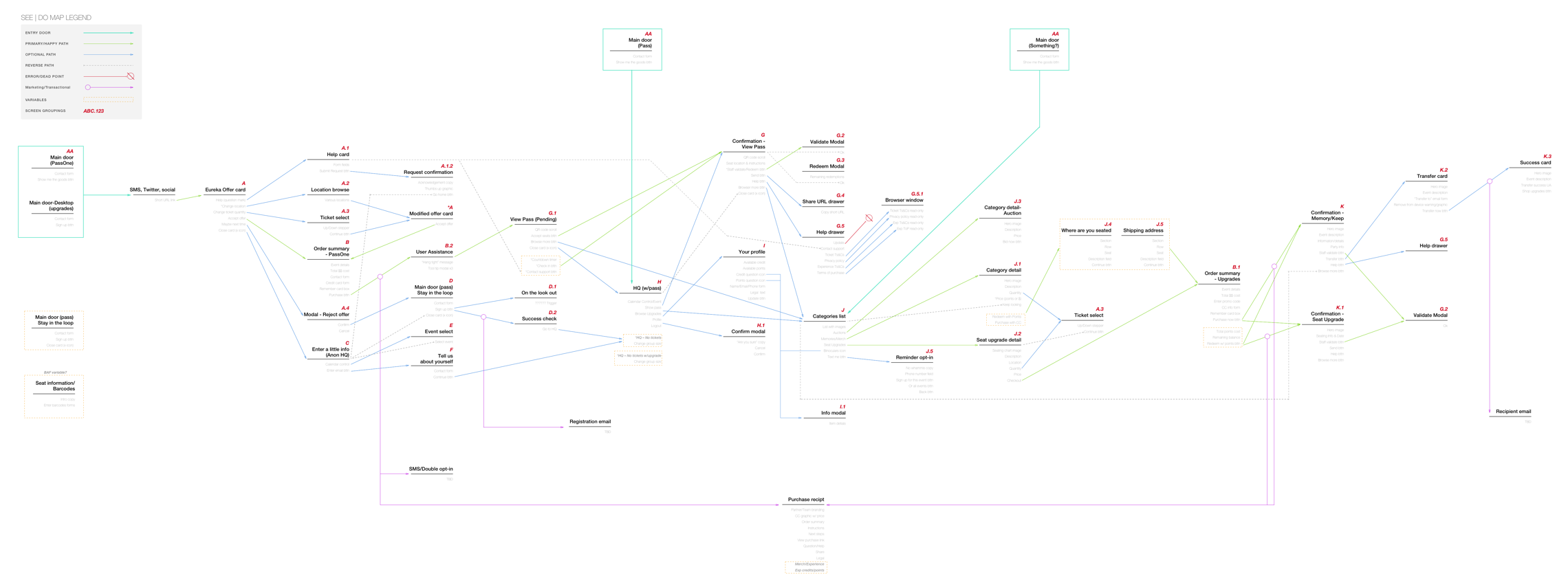
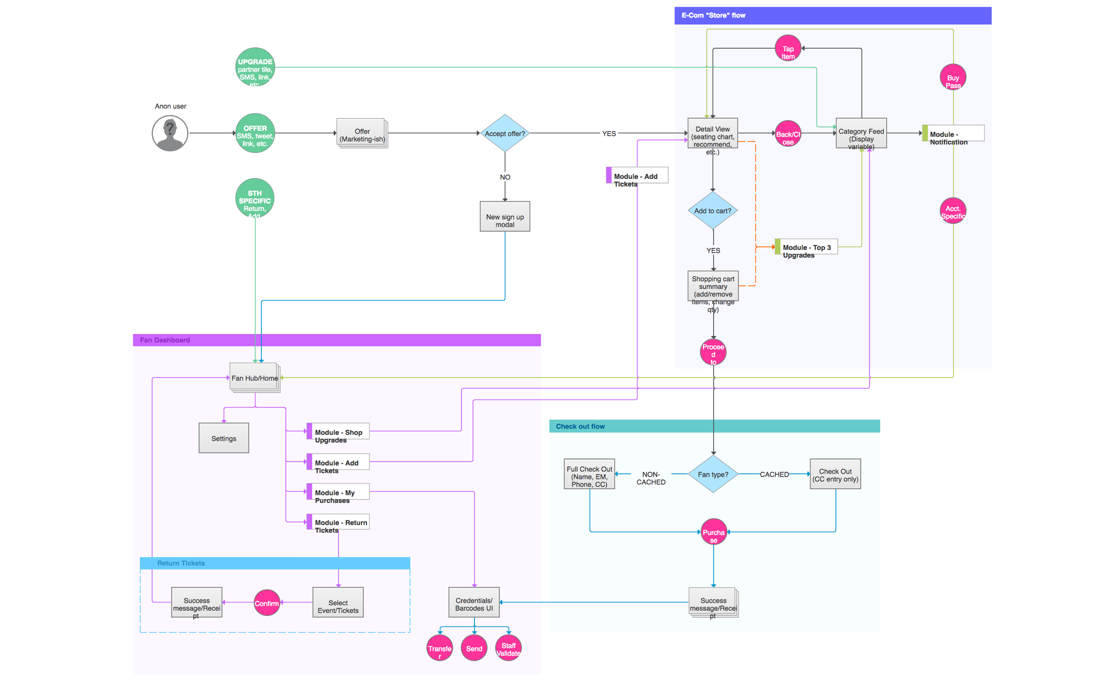
I then performed a baseline heruistic evaluation to identify the major UX gaps in the current product. We also mapped the state of the system using a See | Do diagram. Finally, we identified the primary screens that served as "user flow milestones" and did a card sort excersise to prioritize the content on these screens.
Rapid design sprints & information architecture
With a solid understanding of our user's needs and the company's buisness goals, we were then ready to begin brainstorming solutions for improving the overall product.
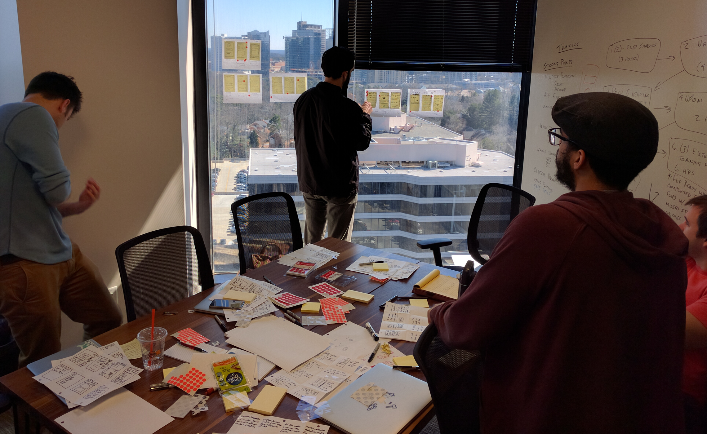
I took the principles from GV's Design Sprint methodology and condesnsed those down to create what I dubbed a "Rapid Design Sprint". The idea is to focus on the rapid ideation and cross-team sharing/unpacking that happens in a traditional Design Sprint but condensed to a single two hour session.
We held multiple Rapid Design Sprints over the course of two weeks. Each session focused on either a unique user or business problem. In order to have both the user-voice and business goals represented, we invited people from across all departments of the company these included; customer service, engineering, operations, marketing, product, sales, and the leadership team.
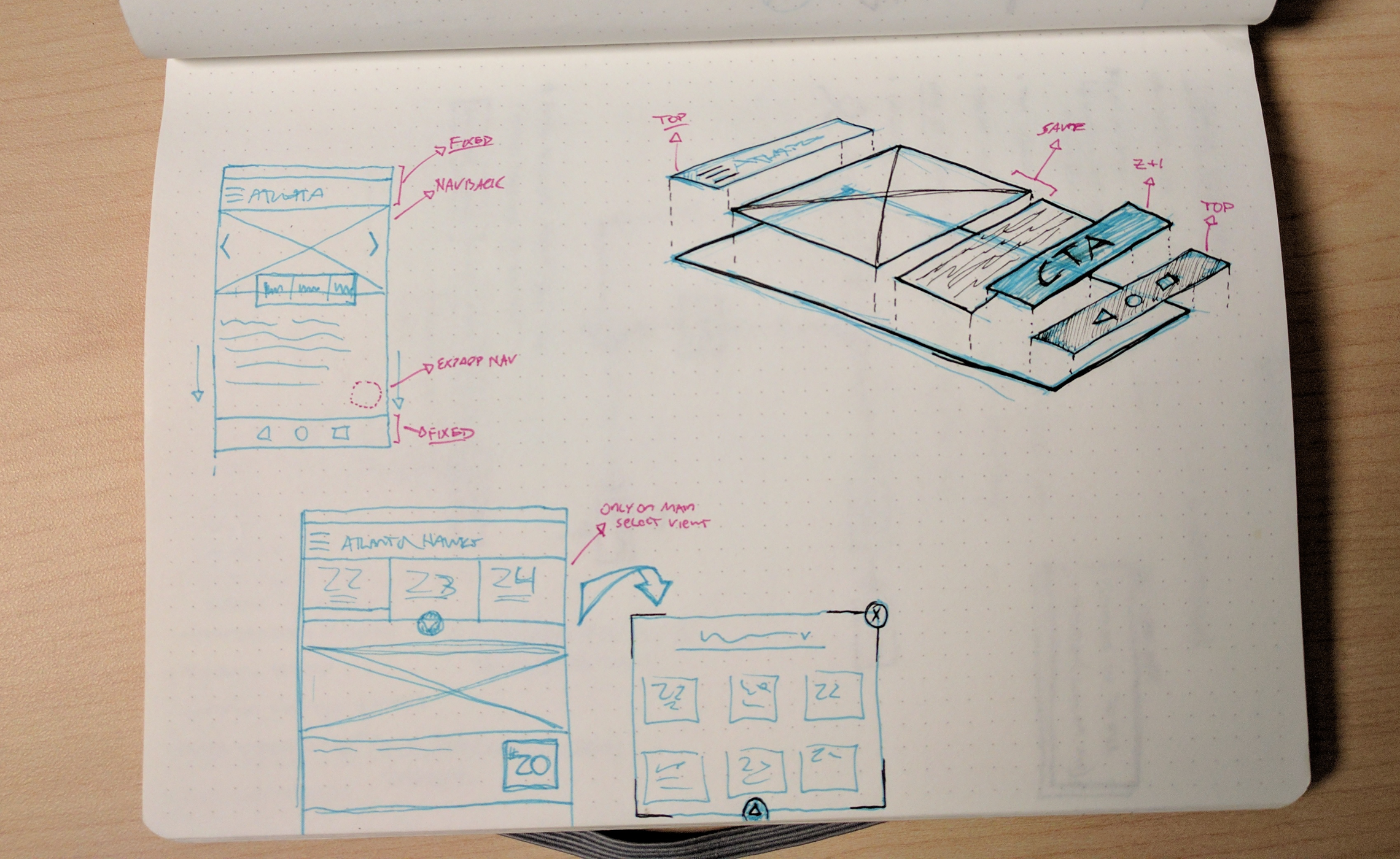
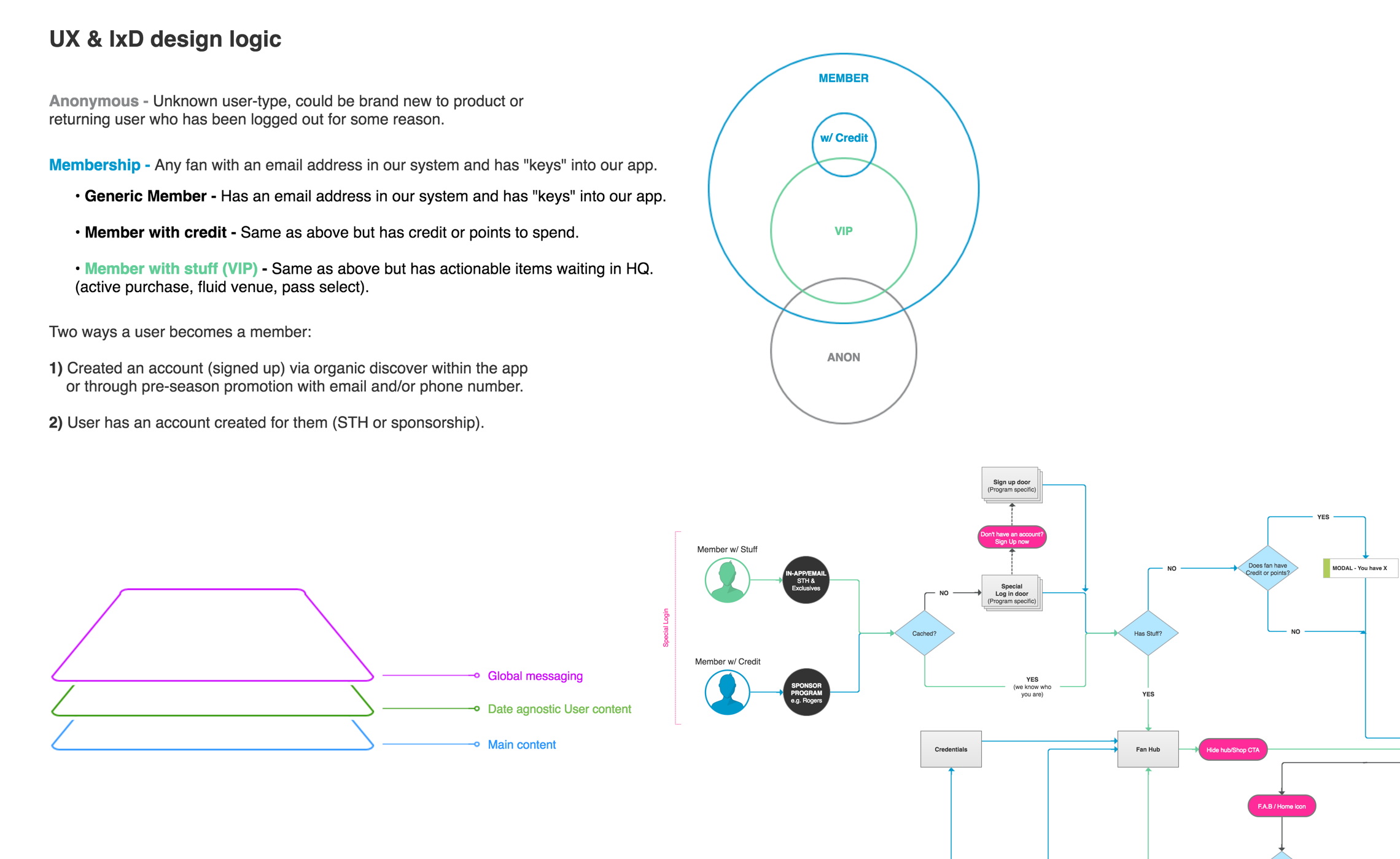
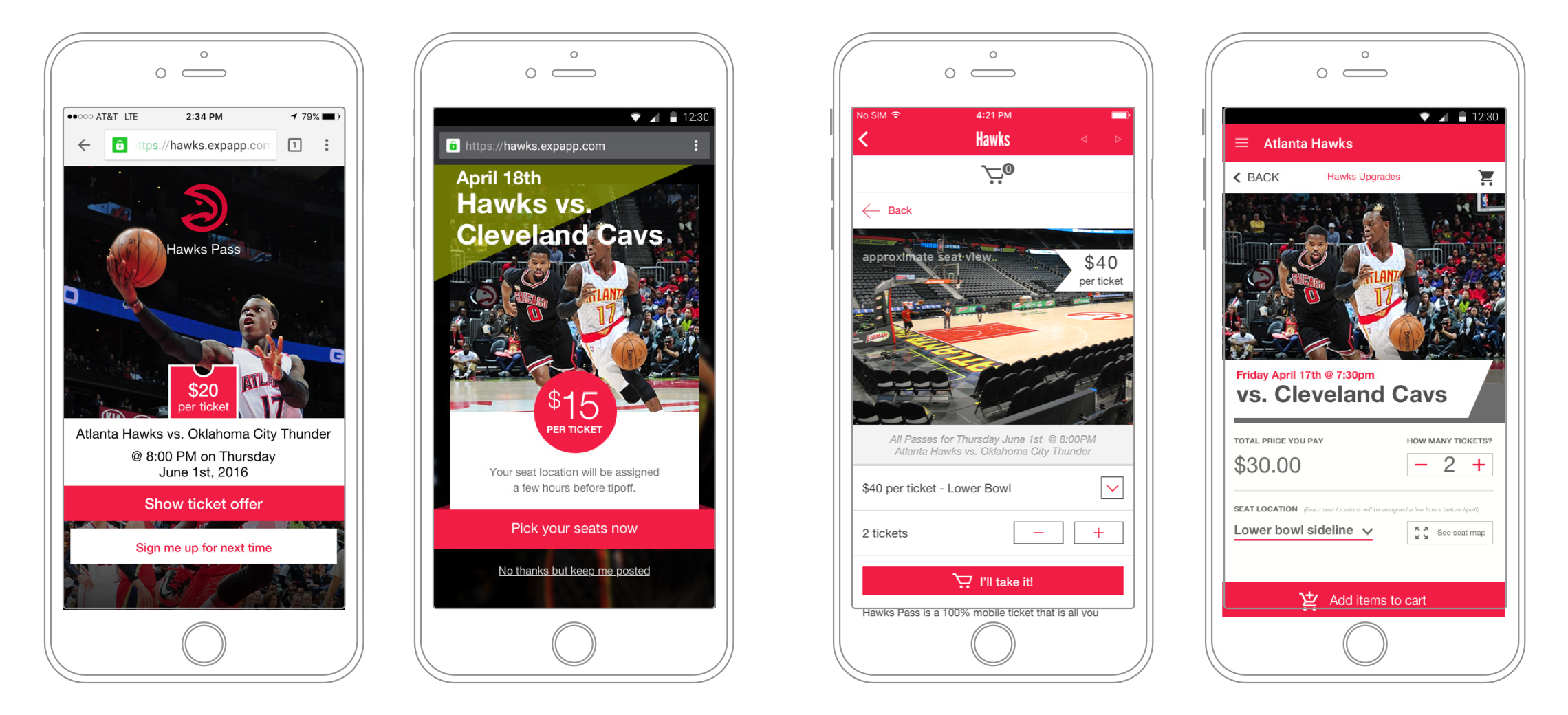
We then begain to wireframe and map out the IA for our new vision based on both the UX team's initial ideas as well as the ideas generated from the Rapid Deisgn Sprints.
User testing & design
To validate the new IA patterns we put these ideas in front of actual users. In ordrer to remain agile and move quickly, we chose to validate ideas while simultaneously iterating on a new visual design brand feel.
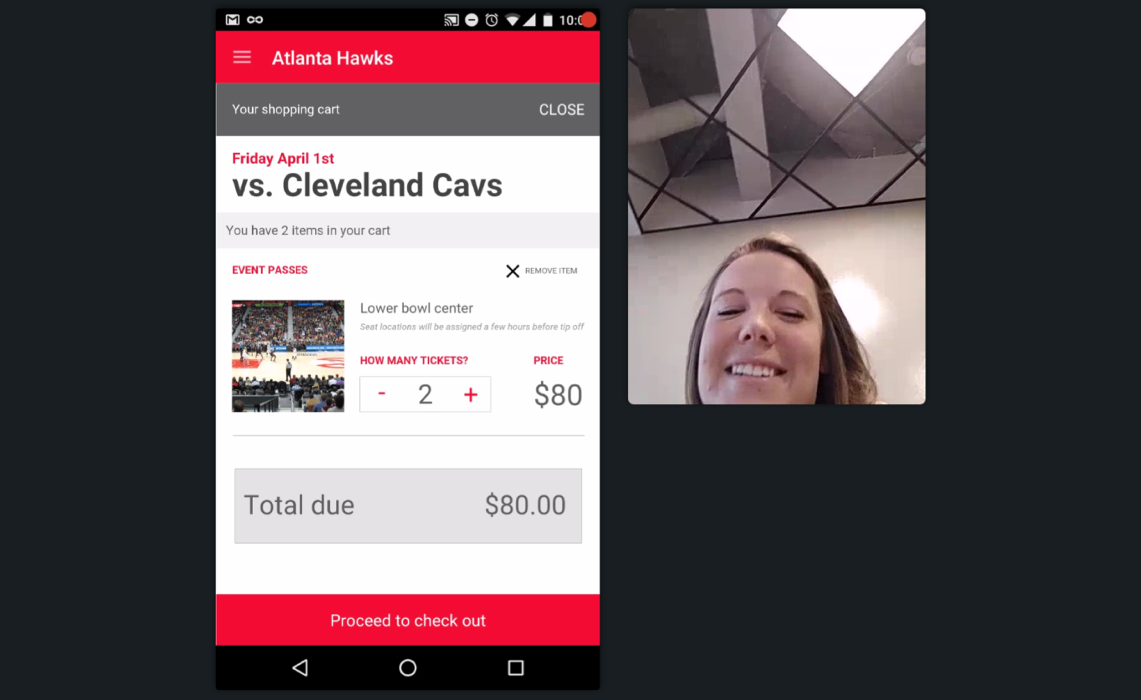
We ended up with two primary prototypes that explored hypothesis for both interaction and visual design. Our test consisted of 10 real users of our platform in an A/B/C counter-balanced format, with C being a control of the current platform UX.
For each user test we recorded qualitative feedback relating to overall impressions, easy of use and general preferences. We also measured qualitative metrics based on success/failure of specific user tasks and mapped these to produce 95% confidence intervals for primary user tasks.
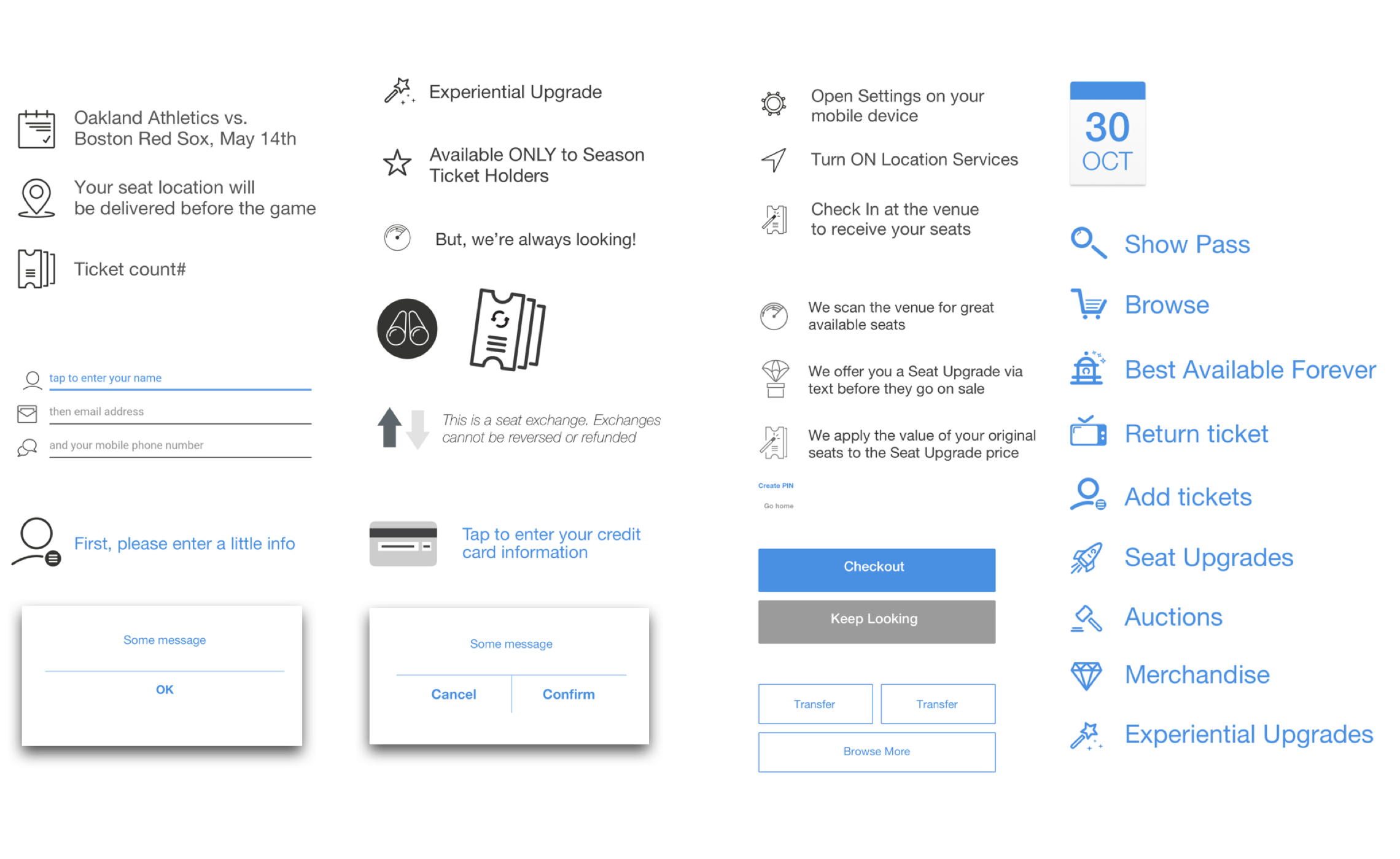
The solution
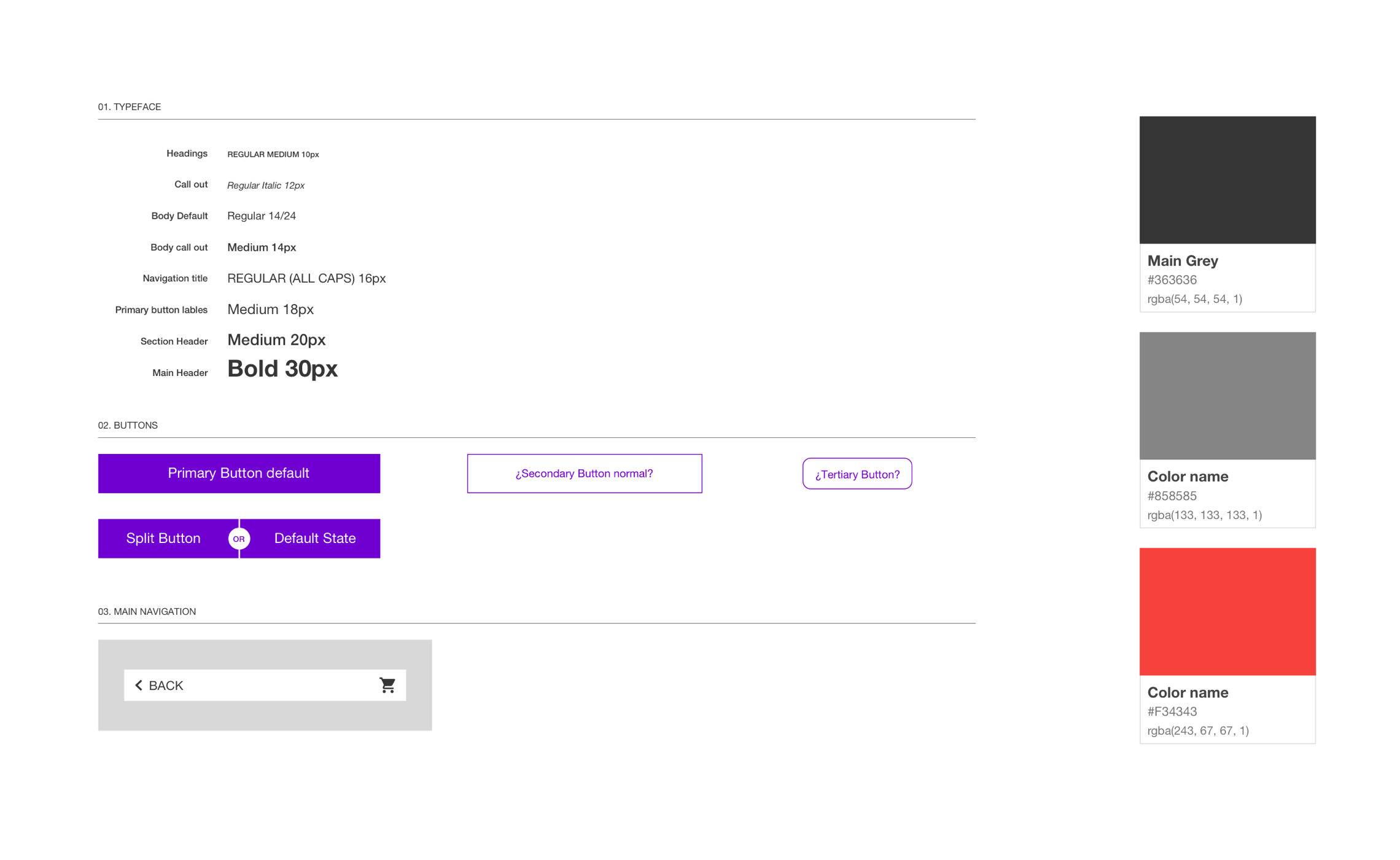
To insure our reimagined platform scaled, we created a modular and reusable design system that consisted of common UI elements that also built up into consistent UX patterns. Think Atomic Design Lite.
Building on what we learned from our user testing and with a UCD mindset, we focused on a UX model of gradual or progressive engagement. Product offerings were shown in a more natural way; already have a ticket to an event? Great! We'll reccomend some upgrades. We also created an easier way for fans to get notifications for upcoming events. This approach gave us the best of both worlds when solving for increased user engagement and showcasing product offerings.
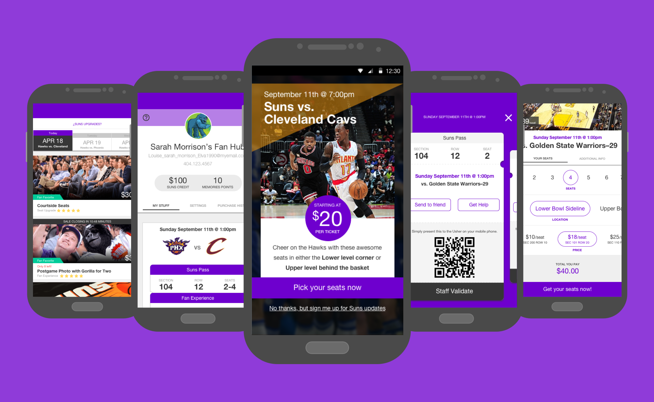
Finally we created a "Fan Hub" for our users that served as a central launchpad for customizing and managing their events. From this central hub users could plan for upcoming events, manage & access their tickets, and manage purchases.