Gather
Crafting a design system from scratch
Overview
Gather was a SaaS event management platform serving the hospitality industry by offering both CRM-like functionality for event managers, tied with a consumer-facing marketplace to help drive new business leads.
TL;DR
As Director of UX, I layed the foundation for the design system while also working hand-in-hand with the other designer on my team to build, define and grow the system.
The challenge
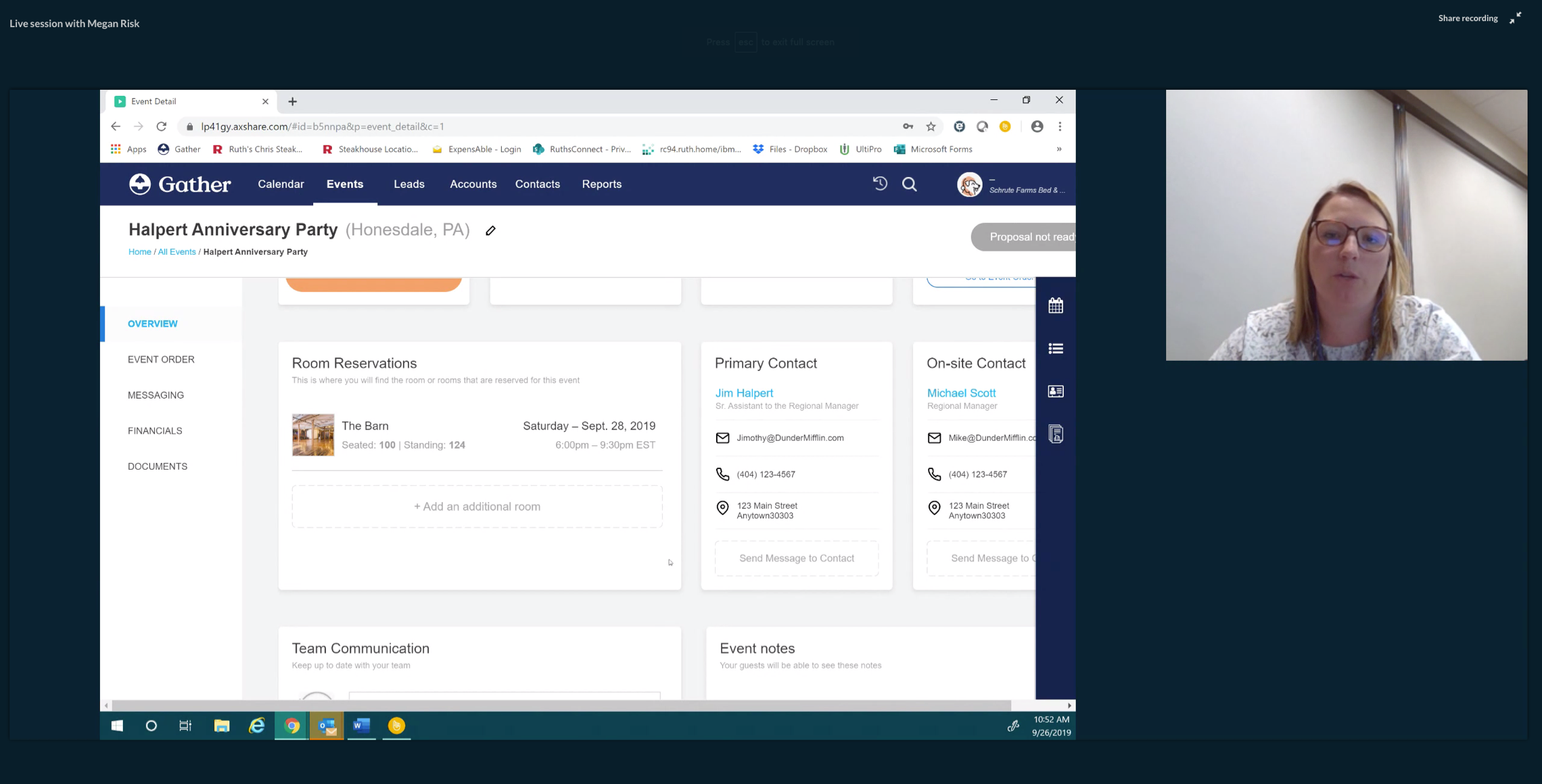
Having been founded in 2013, the tech stack for the product was starting to show it's age when it came to both scale and speed of development. The decision was made to re-write the product moving from Angular to React. This presented the UX team with an opportunity to also "re-write" the interaction patterns and look & feel of Gather.
Our primary UX goals were:
- Refresh the UI to make the product feel more modern
- Improve the user experience in all major "critial path" areas throughout the product
- Create a scalable design system with guidlines for UI and UX patterns
The approach
To begin this project I leaned heavily on my standard "Rapid Design Sprint" UX process – a hybrid approach combining elements from IDEO's Design Thinking and Google Venture's Design Sprint methodologies.
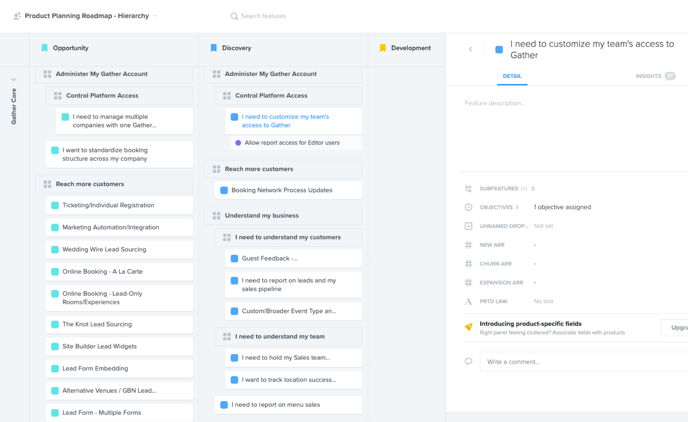
My first step was to fully understand the state of the product by performing a complete UX audit. I began with meeting with my cross-functional partners in the Product, Sales and CX departments to understand current user painpoints as seen by each department. The Gather team was already using ProductBoard to help organize feedback, so this became a primary source of Voice of the Customer for me.
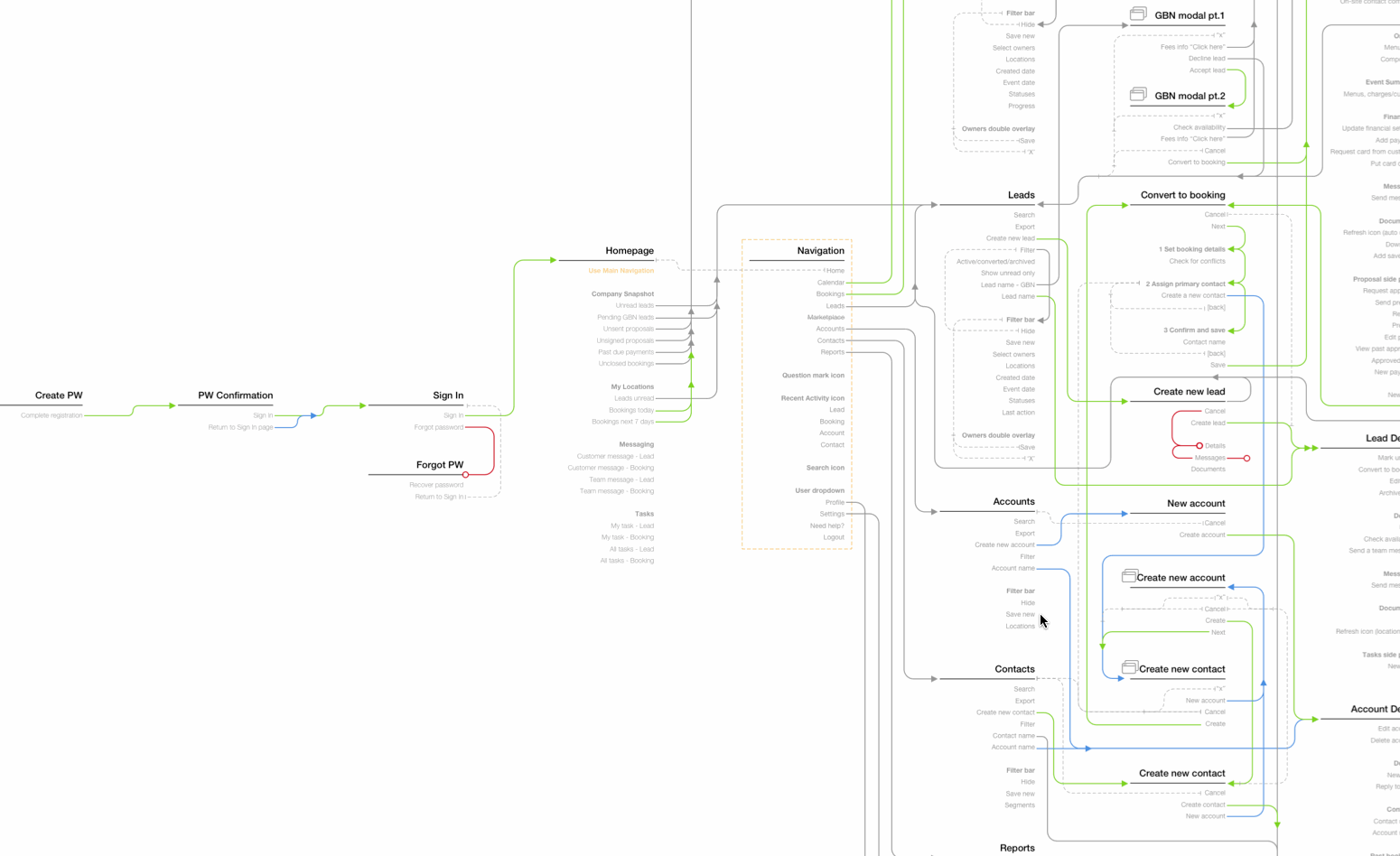
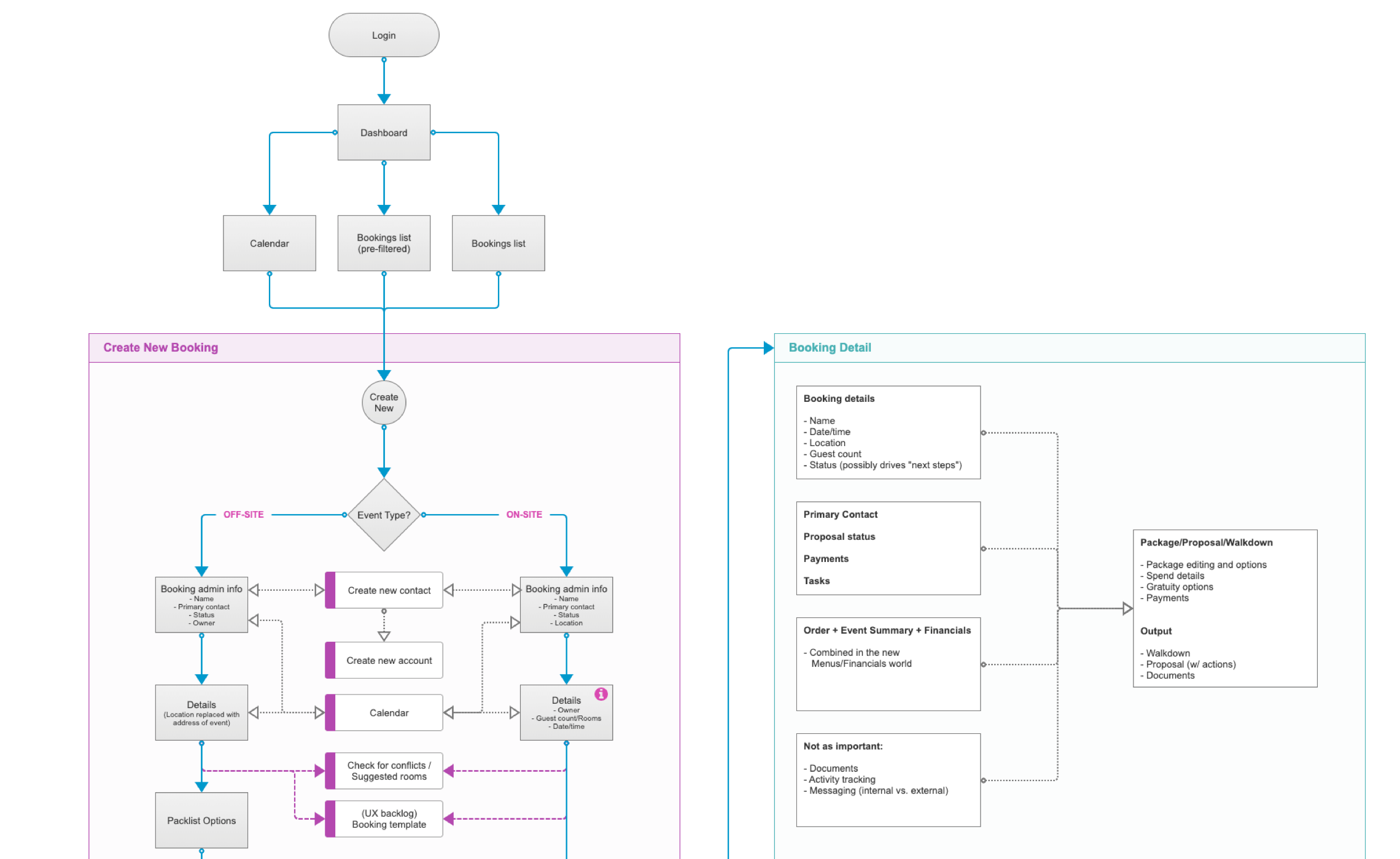
Next, it was time to identify the key critical path areas in the product to use as starting points for a UX refresh. To better understand and map out the holistic product system I focused on creating three primary artifacts:
- Refresh the UI to make the product feel more modern
- Improve the user experience in all major "critial path" areas throughout the product
- Create a scalable design system with guidlines for UI and UX patterns
Exploring the problem space
With the initial discovery and understanding out of the way, the UX team then moved on to digging deep into exploring solutions to the main user problems we uncovered.
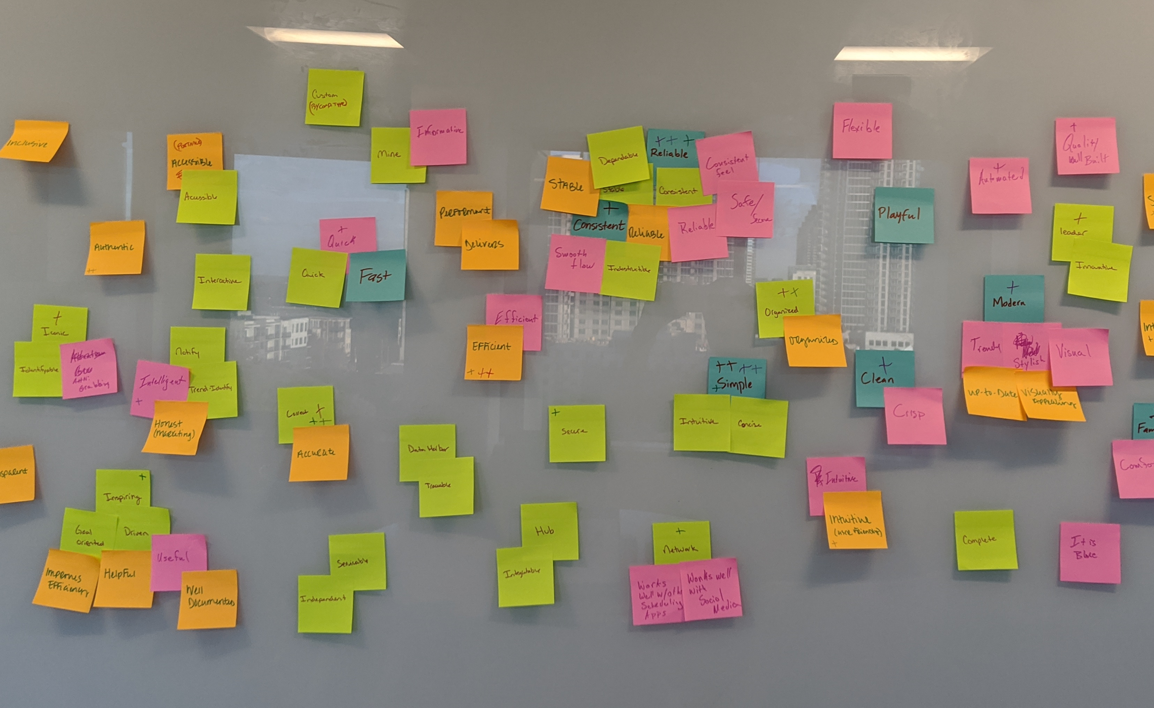
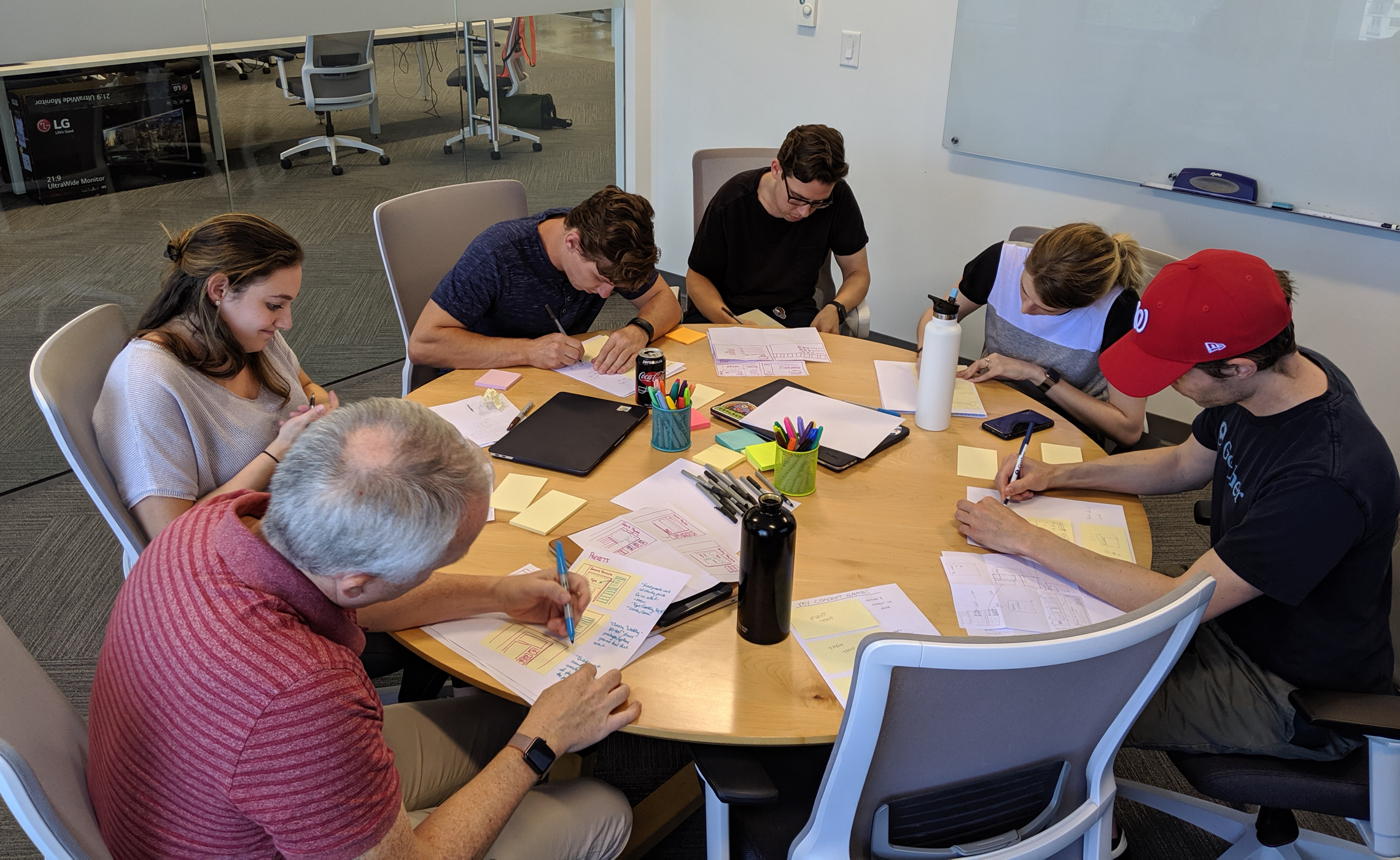
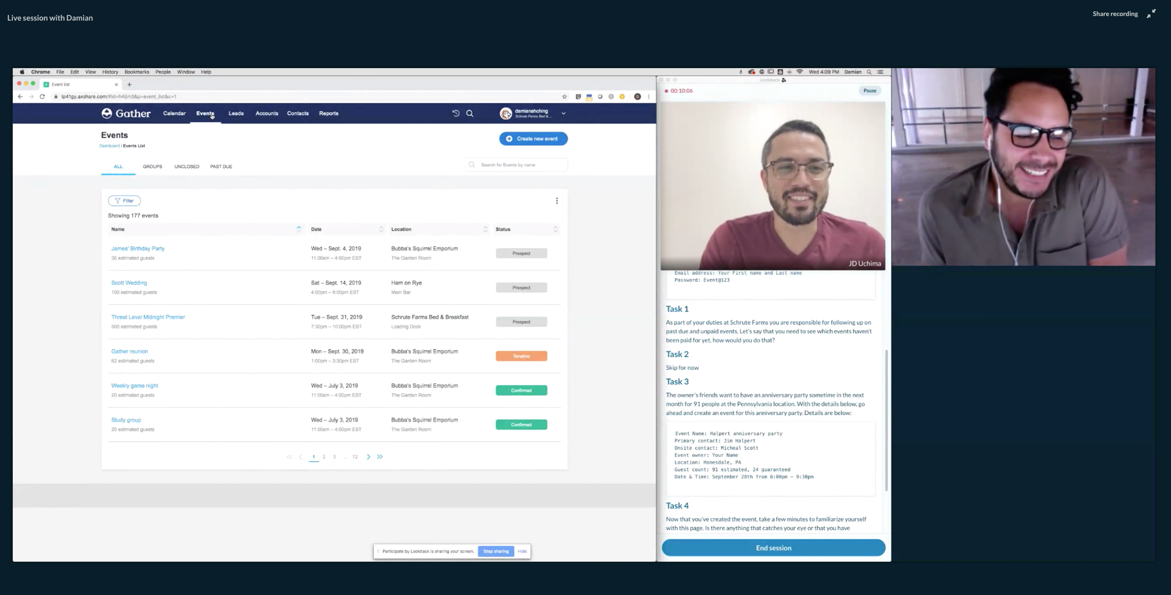
The UX team hosted multiple Rapid Design Sprints over the course of a few weeks. Each session focused on either a unique user or business problem. In order to have both the user-voice and business goals represented, we included and worked closely with various cross-functional teams. We also visited current customers on-site to observe how the Gather product fit into their day-to-day lives.
With plenty of ideas to work from, the UX team then began to ideate possible improvements to the product. This phase of exploration was done via wireframes and rough prototypes.

Validating with users
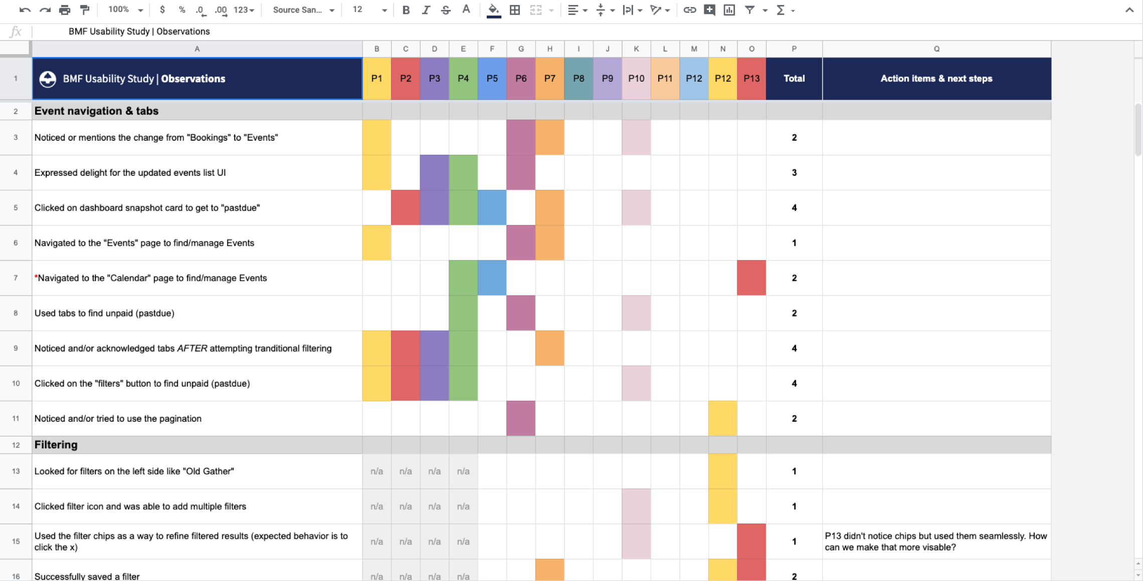
After the ideation phase we had a solid concept for the new direction of the product, that was based around reusable components and improved UX patterns. Since there were so many UX improvements we were tackling, a primary goal was to vet these new UX patterns and ideas with our users.
In order to help ease any concerns from the business around a potentially drastic product update, we also measured qualitative metrics based on success/failure of specific user tasks and mapped these to produce 95% confidence intervals for primary user tasks. We were able to specifically point to success around both completion rate for new bookings as well as error reduction when creating a new booking in the new system.
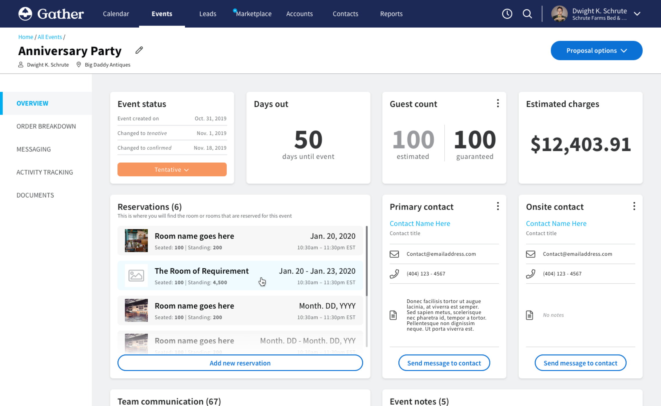
The design
After the ideation phase we had a solid concept for the new direction of the product, that was based around reusable components and improved UX patterns. Since there were so many UX improvements we were tackling, a primary goal was to vet these new UX patterns and ideas with our users. In order to help ease any concerns from the business around a potentially drastic product update, we also measured qualitative metrics based on success/failure of specific user tasks and mapped these to produce 95% confidence intervals for primary user tasks. We were able to specifically point to success around both completion rate for new bookings as well as error reduction when creating a new booking in the new system.
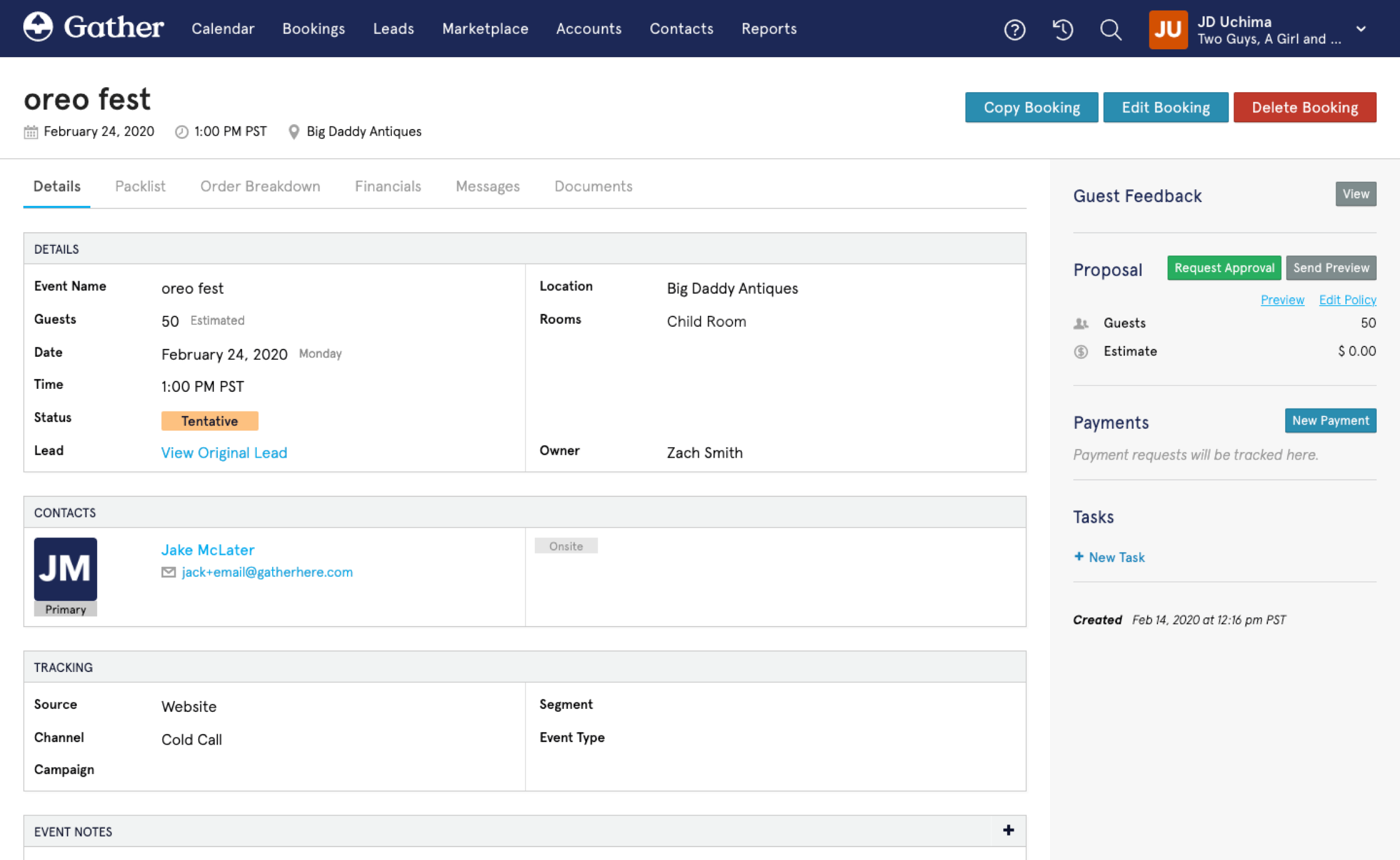
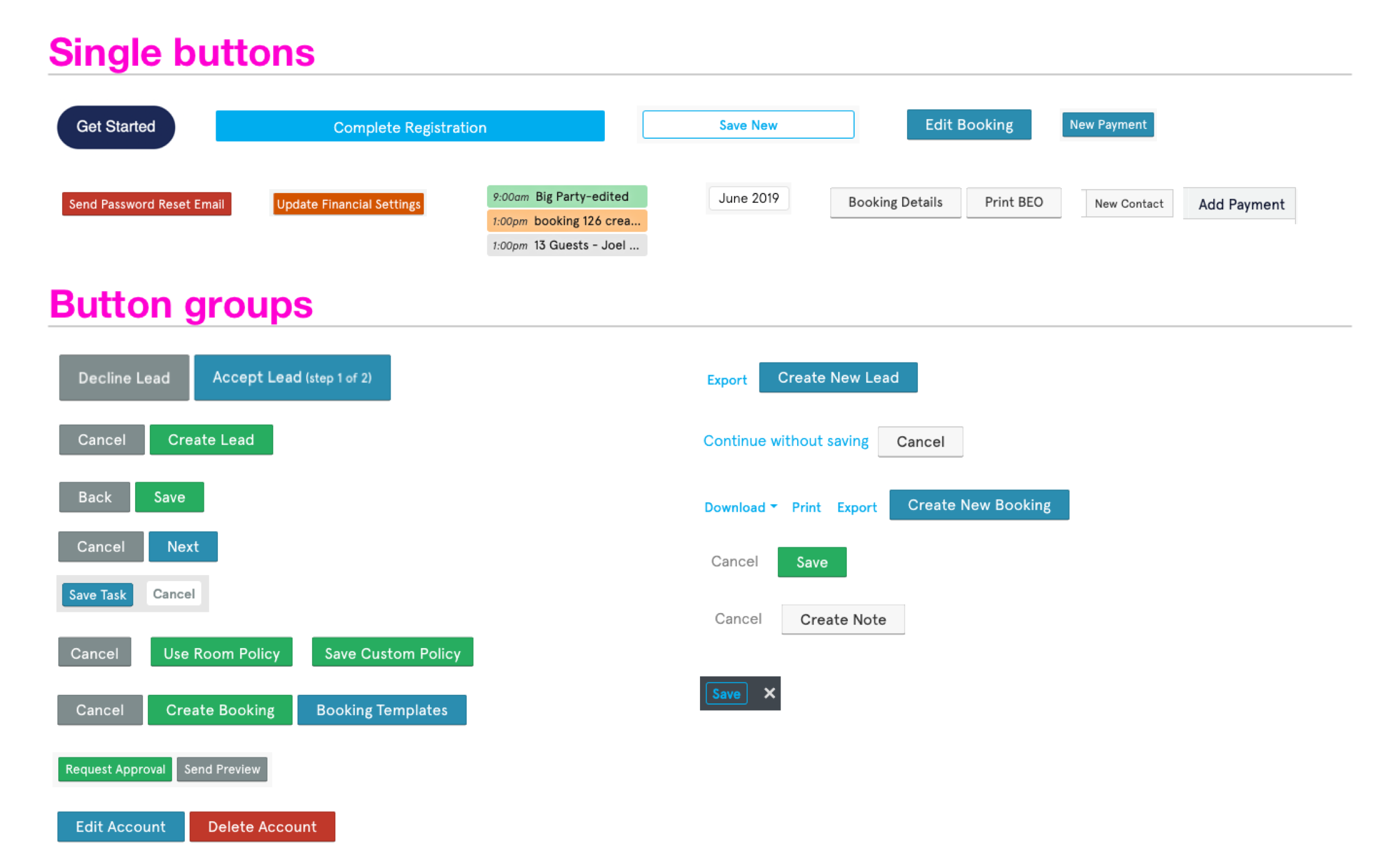
Building the components
Typically at this point is where you would expect to see buzz words like atoms, molecules, organisms, etc.
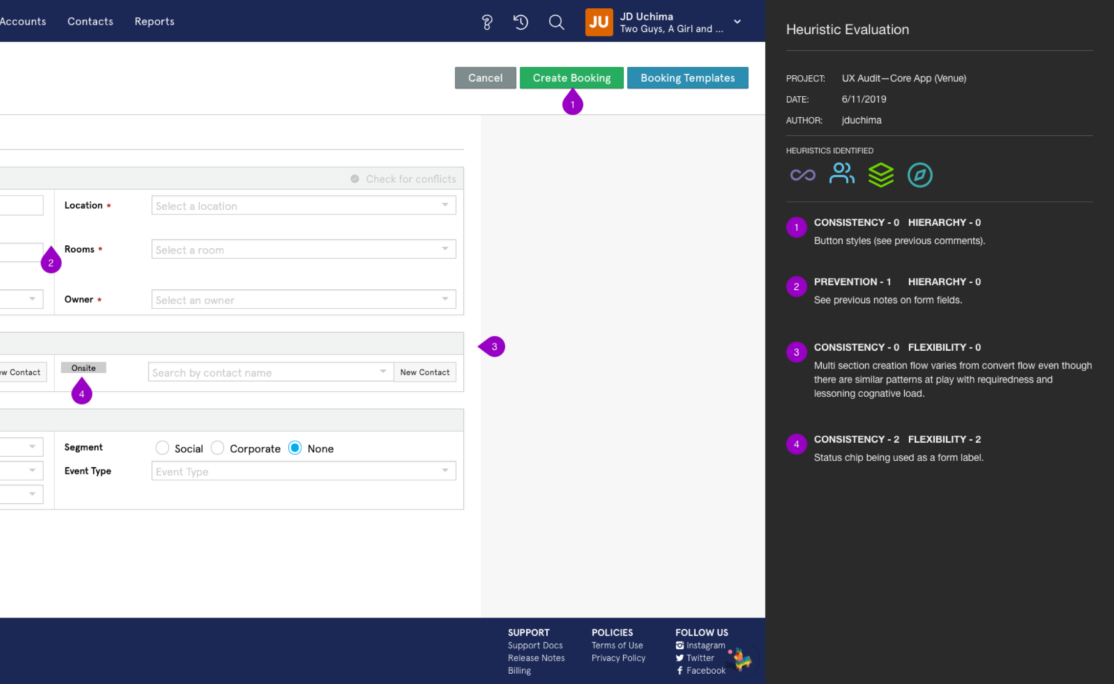
Soapbox time: Although the ideas that Brad Frost outlined in "Atomic Design" are great, he himself says that Atomic Design is simply a mental model for approaching a design system. It's practically impossible to create a fully coherent design system when starting with atoms first. In reality what you end up with are a series of disjointed experiences that make the system harder to maintain.
Instead of trying to start with atoms or molecules, we built the design system organically. We would create flows and screens holistically and then break those down into smaller reusable components (atoms), which we then documented.
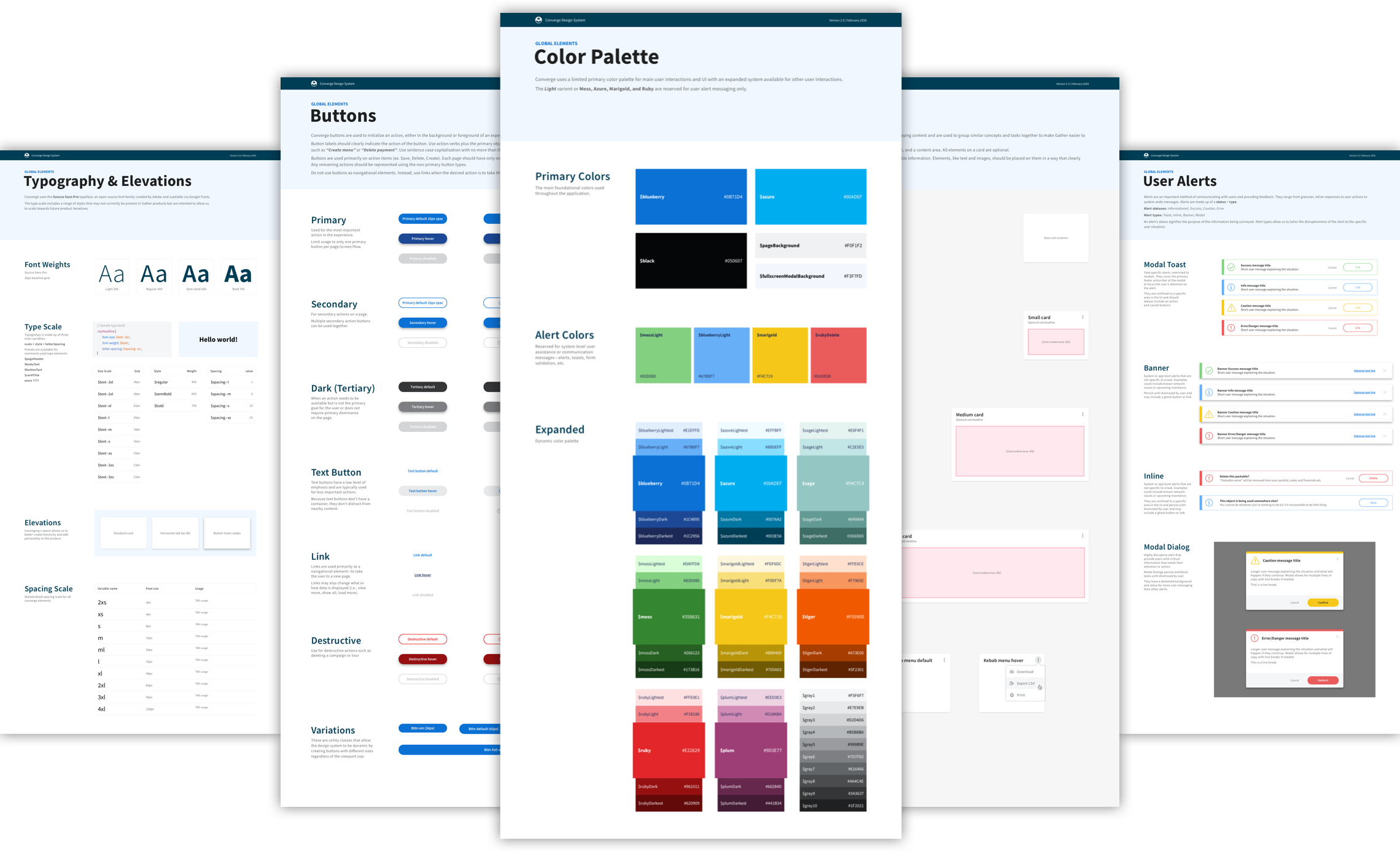
The solution
Throughout the entire process of building out the design system, the UX team worked closely with our front-end developers to ensure that this design system wasn't just a series of Sketch symbols. With every new component created and documented, there was a process in place for adding that new component to our dev team's StoryBook instance. The final design system encompassed both tactical Sketch libraries and symbols as well as usable React code.
Lessons learned: As much as we tried to document new patterns in real-time, it became more and more difficult to build in "documentation writing" into our sprint process. With a team moving quickly, documentation becomes an afterthought sometimes. Building in this writing time into our sprint would have helped avoid going back and writing rules retroactivley.